This article will provide you with a general store planning overview. The balance of GRANT’s guide follows this planning outline with specific design and equipment elements.
Up until a few years ago, when we spoke with our customers about successful store merchandising, planning, and design there were certain key elements emphasized.
These included:
- Picking the right location.
- Signing the appropriate lease.
- Selling the most current merchandise.
- Hiring and training great people.
- Constantly promoting the store through both public relations and advertising.
- Establishing very aggressive pricing policies.
- Creating stores that are fun, interesting, and exciting.
- Being vigilant about the consistency of all of the above factors with both new and old stores.
These elements have not changed. The requirements have simply become tougher. The retail market place has changed and the advent of Internet-based commerce (e-commerce) demands that the store of the future be as different from the computer screen as a live concert is from a clock radio.
Online computer buying will impact every retail industry because it allows consumers easy access to product information from home or office. From their computer or PDA, at any time of day or night your customer can access information,comparison shop, receive discounts and order merchandise from on-line retailers. Why get dressed, drive to a shopping center, park, deal with the kids, etc., when you can simply shop from home?
To combat this, and to remain commercially viable, the aggressive retailer has to create a store that provides a sensory experience that cannot be created with a computer. Modern stores should use sound, texture, graphics, lighting, and video combined with great staffing to ensure their customers have an enjoyable shopping experience. The merchant of tomorrow will be agile and adaptable and will set themselves apart from other retailers. Merchants will sell solutions, not just product.
New stores will provide their own special “WOW” factor that pulls customers in to the store and keeps them there. Why do customers love to shop at Nike Town, Old Navy, The Disney Stores, or the GAP? Because these stores have differentiated themselves through branding and product from their competitors.
These are the design factors you must consider when planning your new store or redesigning your existing facility.
1. THE STORE FRONT
The store front should all but sing. The sign should be graphically strong and descriptive enough that anyone driving by will immediately know what you sell. The sign should be big, bright, multi-layered, and fun.
Make sure the logo is prominent because you will be using it to create brand awareness throughout the shop and in all your media presentations and advertising.
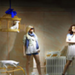
Maximize the opportunities in your window displays. Install large display windows. Back them with walls so people focus on what’s in the window and not what’s behind it. Hire the best window trimmer in town and create memorable windows on a six-week and/or seasonal basis. Your display windows can do more to attract new customers than any single design element you can place inside the store so “don’t scrimp and always be consistent.”
2. THE ENTRY
The entry to the store should be a portal in to Retail World. From the front door forward your customer should quickly be transported into sensory overload. Sound, sight, and motion should be immediate and strong.
Brand the store at the entry with a logo inset into the floor with tile or paint. Do the same overhead with a ceiling graphic. Have your window trimmer create a strong visual component in the entry foyer with a seasonal display that “demands” to be noticed.
3. FLOORING
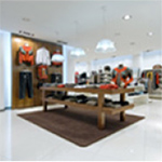
Use different types of flooring material to create texture in the store. The entry foyer might be slate with steel and mosaic tile logo inlays. Commercial vinyl flooring with inlaid laser cut logos and icons can be used in the aisles. Custom carpet that pulls in your stores colors and logo can now be created at a price that is comparable to “off the shelf” carpet. Remember that the floor and ceiling will “bracket” your merchandise. Make sure the floor adds value to the ambiance of the store.
 4. CEILING AND LIGHTING
Forget dropped T-bar ceilings with fluorescent lights. Shoot for tall dark ceilings and add intimacy with dropped soffits, space frames, trusses, neon and graphics.
Lighting will have more of an impact on your store than any singular design aspect. Use track lighting with adjustable halogen lamps to “punch up” displays and to guide customers throughout the shop. Tailor fluorescent lamps with color corrected bulbs and egg crate diffusers to create an ambient light that is conducive to shopping. Consider lighting “effects” such as moving lights, color screens, or theatrical effects that will enhance the shopping experience.
5. THE POS COUNTER
Get it away from the entry. Create traffic patterns that allow entry into your store without being immediately confronted by a cash register or by a line of customers waiting to check out. Make sure the counter is clearly marked with an overhead display or soffit and load the counter with point of sale merchandise opportunities. These might include plexi bins holding small impulse items as well as showcases that serve as counter tops so your customers have to see what’s in them as they make their purchases. Many of our clients make 25% of their sales from the counter area and over 33% of their profits because the margins are so much higher.
6. WALL FIXTURES
Go vertical. Merchandise up to 10 feet high on the walls and let your salespeople help customers get things down. Don’t pack the walls with shelves. Break them up with merchandise, graphics, photo boxes, videos and texture. Add brick or stone wall sections to the walls to create texture and add interest. Use flexible fixtures such as slatwall that allow you to change your merchandising as products change. Don’t be monotonous. Division and color are important so segment the walls into sections that provoke customer interest. Use different types of merchandising systems: Slatwall, grids, recessed standards and wall cases. The variety of your visual presentation will provoke additional interest and sales.
7. FLOOR FIXTURES
The floor fixtures should also be flexible. Long runs of gondolas should be limited because they will bind your store into an immovable pattern. The store of the future needs to be movable so most of the fixtures should be on casters so you can periodically “reinvent” your shop. Make sure the sales floor is wired for electric and computer cables. Fixturing will become much more customer interactive and future displays will incorporate video and computer technologies to impact sales at the point where the purchasing decision is most often made.
8. SOUND AND MUSIC
Would you rather shop in a store where your toes are tapping or where the only sound is the sales people snapping their chewing gum? Sound is the world’s single most powerful emotional element. It can pull your heartstrings and open your check book. Sound encourages customers to stay in your store longer and to come back more often. Use in store music effectively and consistently.
 9. SIGNS AND GRAPHICS
Signs and graphics will help customers find their way through the store and will add to the overall ambiance of the shop. In some manner the stores logo should be present on every sign in the store so your customers will constantly be reminded of where they are shopping. In-store graphics should be large and distinctive and should include a combination of photo blow ups, back lighted transparencies and props that all promote your shops identity and theme.
 10. VIDEO
Video monitors can serve as an entertainment back drop and provide information about a variety of subjects. For instance, in a bike shop, racing, mountain biking, travel, tune ups, and bike model and manufacturing information are all topics that will capture your client’s attention and keep them in the shop longer.
11. KIOSK / COMPUTERS
In-store interactive computers will really separate future planning stores from those in operation today. Imagine an equipment section with all your products on a CD ROM catalog that your customers can scroll through and print out on the spot. Imagine a computer that allows products to be customized to fit your customers needs. Imagine an Internet site that allows visitors to order your stores products, capture visitor information and link up with your commercial partners. Imagine your competitors having in-store computers and an Internet site and you not having the same!
SUMMARY
In a few years, retail, once again, will reinvent itself. The channels of commerce are changing and so are retail ownership patterns. Bigger retail is becoming more common, niche markets are being exploited and online retailing continues to explode. Small retailers will be over-shadowed by well-financed large scale chains who will look for “category killing” market share in your community. Profitable shops will have to be progressive. I would encourage any retailer who wants to stay ahead of the pack to find a retail consultant and/or designer who can help them analyze and strengthen their store’s position in the market place. The goal is simple: Your store should be your customers “favorite place to shop.” Do whatever it takes to make that happen!


